User Interface in Core
Overview
UI in Core includes all the 2D elements to build menus, notifications, dialog boxes, and heads up displays (HUD's). Creating UI elements is mostly a drag-and-drop process, where any UI element is added to the scene with ease.
UI Elements
Control
A Control (UIControl) is a CoreObject which serves as a base class for other Controls. All UI classes include the properties within a Control such as the position and size properties.
More information can be found in the UIControl API
Container
All other UI elements must be a descendant of a Container (UIContainer) to be visible. It does not have a position or size. It is always the size of the entire screen has no properties or functions of its own, but inherits everything from CoreObject.
More information can be found in the UIContainer API
Container Types
Containers have a Content Type which allow creators to specify the way the UI works and optimize performance. By default, Containers will have the Dynamic type, but can be made more performant by changing their type to Static in instances where they do not need to move.
UI Type Definitions
- Static: Used for any UI that does not need to move.
- Dynamic: Used for any UI that will move.
- Texture: For extremely complex UI with many elements to be rendered as a single texture, like Minimap UI.
Texture Content Type
The Texture Content Type has greater cost than the other UI Container Content Types, but this cost is fixed. It is recommended to only use one Texture per project.
Panel
A Panel (UIPanel) can be used for containing and laying out other UI elements, such as images and text. It is optional and is best used for organization.
Panels also have an Opacity that will be applied to all elements inside of it.
More information can be found in the UIPanel API
Scroll Panel
A Scroll Panel (UIScrollPanel) is a Panel that has a scroll bar for overflowing elements.
More information can be found in the UIScrollPanel API
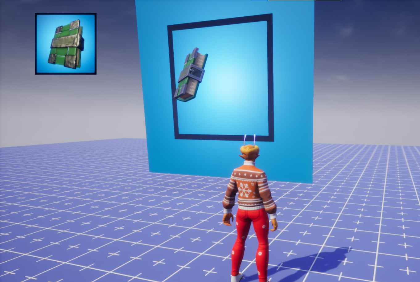
Image
An Image (UIImage) displays a given image (found in the Core Content window).
More information can be found in the UIImage API
Change the Image in the Editor
Like Materials on static mesh objects, there are two ways to change the image being displayed; either by dragging from the UI Textures category of Core Content or by selecting from the Properties window, and double-clicking the icon in the Image property.
Change the Image with Script
If you have an asset reference to an image (or its MUID), you can use the UIImage:SetImage() function.
Images can also be manually set to show a player's profile picture by using the UIImage:SetPlayerProfile() function.
Change the Color of an Image with Script
The color of an image can be changed dynamically by using the UIImage:SetColor() function.
Text
A Text (UIText) displays text.
More information can be found in the UIText API
Text Fonts
Change the Font
Like Materials on static mesh objects, there are two ways to change the font of text; either by dragging from the Fonts category of Core Content or by selecting from the Property Window, and double-clicking the icon in the Font property.
The font can also be changed with script by using the UIText:SetFont() function.
Change the Text with Script
The content of the text (what is actually being displayed) can be changed by setting a new value to the UIText.text property to a new string.
TextObject.text = "New Value"
Change the Color of Text with Script
The color of text can be changed dynamically by using the UIText:SetColor() function.
Get the Visual Size of a Text with Script
When the text is being rendered on the screen, you can get the amount of pixels that it takes up on the screen by using the UIText:ComputeApproximateSize() function.
Progress Bar
A Progress Bar (UIProgressBar) displays a dynamically filled rectangle that can be used for things such as health indicators, loading screen, and much more.
More information can be found in the UIProgressBar API
Change the Progress with Script
The progress is set by using a scale of 0 to 1 (meaning 50% would be 0.5). This can be set by changing the value of UIProgressBar.progress to a new number in that range.
ProgressBarObject.progress = 0.6 -- 60%
Button
A Button (UIButton) can be clicked and interacted with. This must be in a client context to function.
More information can be found in the UIButton API
Listening to Events
A button has several events that can be listened to that informs you if it was clicked, hovered, etc. You can listen to these by figuring out which one is needed (look at the API for reference) and connect it to a function.
An example using UIButton.clickedEvent
function OnButtonClicked(button)
    print(button.name, "clicked")
end

ButtonObject.clickedEvent:Connect(OnButtonClicked)
Perk Purchase Button
A Perk Purchase Button (UIPerkPurchaseButton) is similar to a regular button but allows players to purchase perks within a game. It is designed to present a consistent purchasing experience for players across all games.
More information can be found in the UIPerkPurchaseButton API
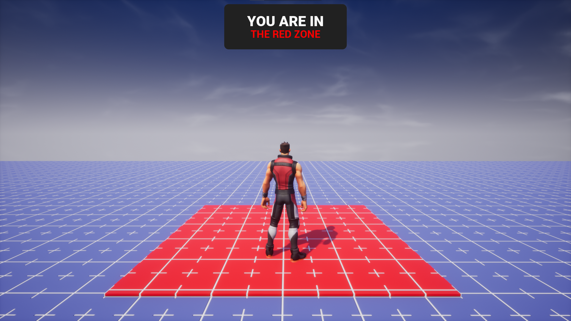
Toggling UI With a Trigger
There may be situations you want to show UI when a player enters a certain area in the map. This can be done by utilizing Triggers.
In this example, the trigger will show a UI that informs the player that they are in a specific zone, the "Red Zone."
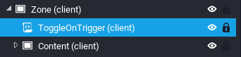
Create a Script
First, you need to create a script that will handle this implementation.
- Create a script inside the UI that will be toggled using the trigger. The name of the script can be anything; this tutorial will be using
ToggleOnTrigger.
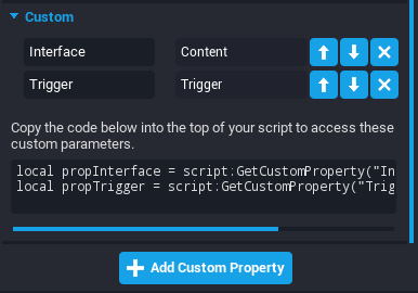
Create Custom Properties for the UI and Trigger
Second, you need a reference to the UI and to the trigger so that you can implement the required trigger events that then toggle the UI.
- While having the script selected in the hierarchy, in the Properties window, add a CoreObjectReference Custom Property to the script and name it
Interface. - Drag-and-drop the UI from the Hierarchy into the Custom Property you just created.
- While having the script selected in the hierarchy, in the Properties window, add a CoreObjectReference Custom Property to the script and name it
Trigger. - Drag-and-drop the Trigger from the Hierarchy into the Custom Property you just created.
Create Variable References for the UI and Trigger
Now, it is time to begin coding. First, you need to create variables that refer the UI and Trigger Custom Properties.
Add this to the top of your script:
local Interface = script:GetCustomProperty("Interface"):WaitForObject()
local Trigger = script:GetCustomProperty("Trigger"):WaitForObject()
Create Variable Reference to Local Player
The UI should only become visible if the Local Player (you, for instance) enters the trigger. Otherwise, if any Player enters or exits the trigger, the UI will have some very odd behaviour.
Under the Custom Property references, add this to the script:
local LocalPlayer = Game.GetLocalPlayer()
Connect Event When a Player Enters the Trigger
It is now time to show the UI when a Player enters the Trigger. This is used by utilizing the Trigger.beginOverlapEvent event.
At the bottom of the script, add this:
function OnBeginOverlap(trigger, player)

end

Trigger.beginOverlapEvent:Connect(OnBeginOverlap)
Toggle the UI On if the Local Player is Inside
Now you can check to see if the Player that entered the trigger is the ***Local Player**.
Inside the OnBeginOverlap function, add this check:
if not player:IsA("Player") or player ~= LocalPlayer then
    return
end
The parameter is named player so it is easier to understand for the developer, but it is actually an Object, meaning it can be a Player or any CoreObject that enters it. Therefore, this will escape early if the object entering the Trigger is not a Player. This will also escape early if the Player entering the Trigger is not the Local Player.
Next, add this line of code to toggle the visibility of the UI to be inherit (visible only if all the objects it is inside is also visible):
Interface.visibility = Visibility.INHERIT
Connect Event When a Player Leaves the Trigger
It is now time to hide the UI when a Player exits the Trigger. This is used by utilizing the Trigger.endOverlapEvent event.
At the bottom of the script, add this:
function OnEndOverlap(trigger, player)

end

Trigger.endOverlapEvent:Connect(OnEndOverlap)
Toggle the UI Off if the Local Player is Inside
Now you can check to see if the Player that exited the trigger is the ***Local Player**.
Inside the OnEndOverlap function, add this check:
if not player:IsA("Player") or player ~= LocalPlayer then
    return
end
Next, add this line of code to toggle the visibility of the UI to be off:
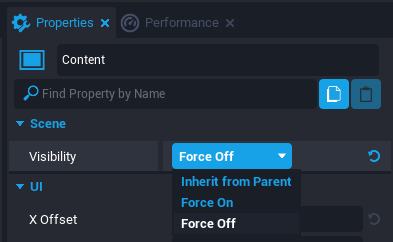
Interface.visibility = Visibility.FORCE_OFF
Hide the UI
Finally, you can disable the visibility of the UI so that when the Player spawns in, it is off by default.
- Click the UI in the Hierarchy.
- In the Properties window, change the Visibility to Force Off.
Final Code
local Interface = script:GetCustomProperty("Interface"):WaitForObject()
local Trigger = script:GetCustomProperty("Trigger"):WaitForObject()

local LocalPlayer = Game.GetLocalPlayer()

function OnBeginOverlap(trigger, player)
    if not player:IsA("Player") or player ~= LocalPlayer then
        return
    end

    Interface.visibility = Visibility.INHERIT
end

function OnEndOverlap(trigger, player)
    if not player:IsA("Player") or player ~= LocalPlayer  then
        return
    end

    Interface.visibility = Visibility.FORCE_OFF
end

Trigger.beginOverlapEvent:Connect(OnBeginOverlap)
Trigger.endOverlapEvent:Connect(OnEndOverlap)
Toggling UI With a Binding
There may be situations you want to show UI when a player presses a certain button. This can be done by utilizing Bindings.
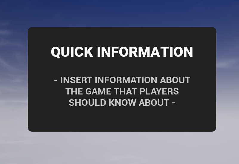
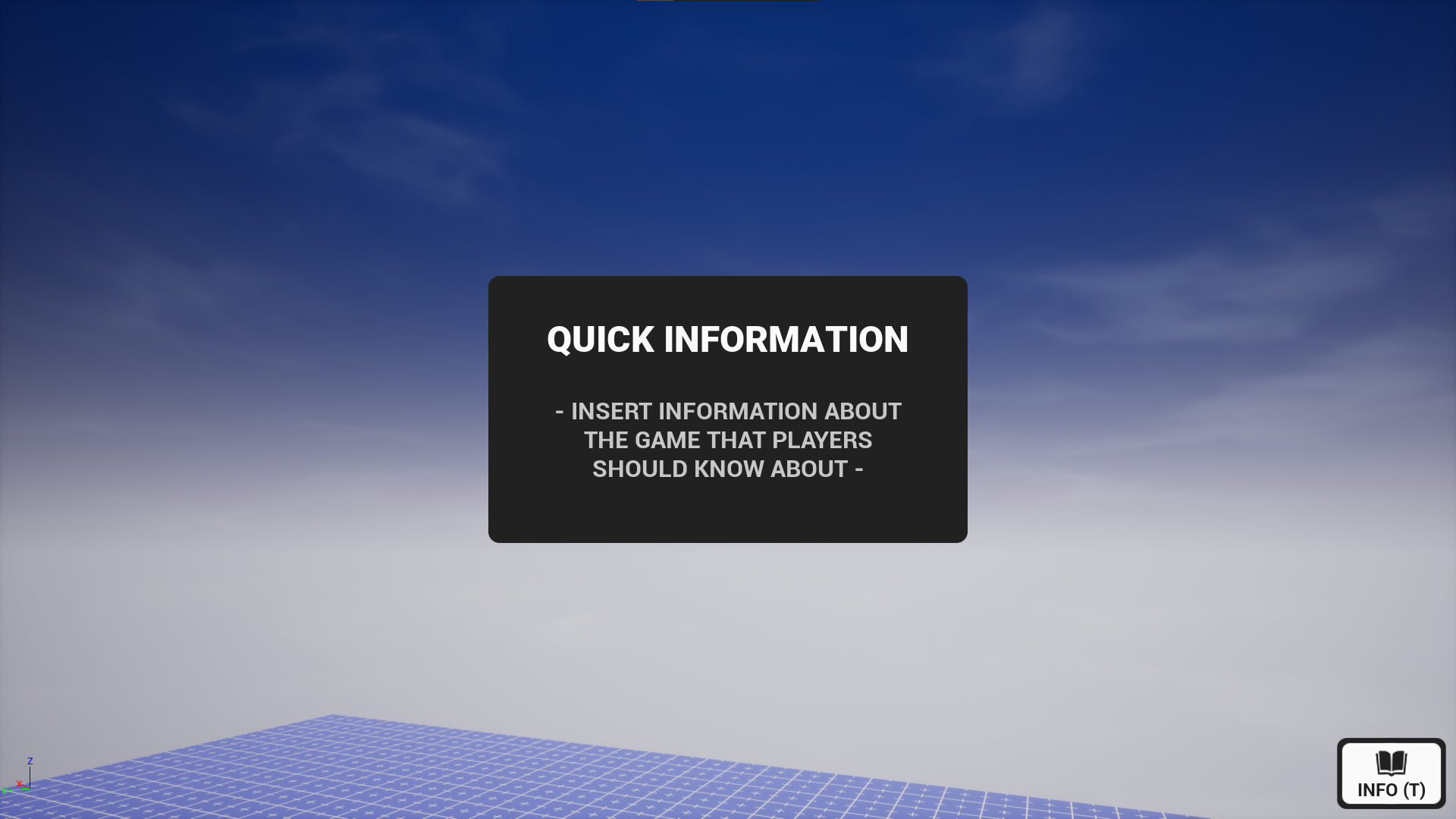
In this example, pressing T will show a UI that gives some quick information to the player about the game.
Create a Script
First, you need to create a script that will handle this implementation.
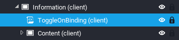
- Create a script inside the UI that will be toggled using the trigger. The name of the script can be anything; this tutorial will be using
ToggleOnBinding.
Create Custom Property for the UI
You need a reference to the UI that will be toggled on and off when a specific binding has been pressed.
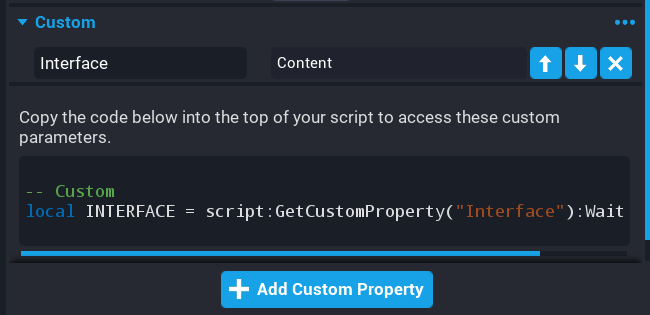
- While having the script selected in the hierarchy, in the Properties window, add a CoreObjectReference Custom Property to the script and name it
Interface. - Drag-and-drop the UI from the Hierarchy into the Custom Property you just created.
Create Variable References for the UI
Now, it is time to begin coding. First, you need to create variables that refer the UI Custom Property.
Add this to the top of your script:
local Interface = script:GetCustomProperty("Interface"):WaitForObject()
Connect Event When a Player Presses a Key
It is now time to show the UI when a Player presses a specific binding. This is done by utilizing the Input.actionPressedEvent event.
At the bottom of the script, add this:
function OnActionPressed(player, action)

end

Input.actionPressedEvent:Connect(OnActionPressed)
Check the Action
The actionPressedEvent event fires when any key is pressed and the function connected to the event will receive the action value for that binding.
The action that will be checked is the Interact action. All actions can be looked at from the Bindings Manager window in the Window menu.
Click here for more information about binding sets.
Add the following code to the top of the OnActionPressed function. This will escape early if the action does not match Interact.
if action ~= "Interact" then
    return
end
Toggle the Visibility of the UI
Toggling the visibility of the UI can be done with a quick if/else statement.
Add this to the bottom of the function:
if Interface.visibility == Visibility.FORCE_OFF then
    Interface.visibility = Visibility.INHERIT
else
    Interface.visibility = Visibility.FORCE_OFF
end
Hide the UI
Finally, you can disable the visibility of the UI so that when the Player spawns in, it is off by default.
-
Click the UI in the Hierarchy.
-
In the Properties window, change the Visibility to Force Off.

Final Code
local Interface = script:GetCustomProperty("Interface"):WaitForObject()

function OnActionPressed(player, action)
    if action ~= "Interact" then
        return
    end

    if Interface.visibility == Visibility.FORCE_OFF then
        Interface.visibility = Visibility.INHERIT
    else
        Interface.visibility = Visibility.FORCE_OFF
    end
end

Input.actionPressedEvent:Connect(OnActionPressed)
Toggling UI With a Button
There may be situations you want to show UI when a player presses a button on the screen. This can be done by utilizing Buttons.
In this example, pressing the button will show a UI that gives some quick information to the player about the game.
Create a Script
First, you need to create a script that will handle this implementation.
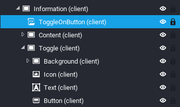
- Create a script inside the UI that will be toggled using the trigger. The name of the script can be anything; this tutorial will be using
ToggleOnButton.
Create Custom Properties for the UI and Trigger
Second, you need a reference to the UI and to the trigger so that you can implement the required trigger events that then toggle the UI.
- While having the script selected in the hierarchy, in the Properties window, add a CoreObjectReference Custom Property to the script and name it
Interface. - Drag-and-drop the UI from the Hierarchy into the Custom Property you just created.
- While having the script selected in the hierarchy, in the Properties window, add a CoreObjectReference Custom Property to the script and name it
Button. - Drag-and-drop the Button from the Hierarchy into the Custom Property you just created.
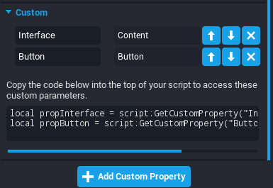
Create Variable References for the UI and Button
Now, it is time to begin coding. First, you need to create variables that refer the UI and Button Custom Properties.
Add this to the top of your script:
local Interface = script:GetCustomProperty("Interface"):WaitForObject()
local Button = script:GetCustomProperty("Button"):WaitForObject()
Connect Event When a Player Presses the Button
It is now time to show the UI when a Player presses the Button. This is used by utilizing the Button.clickedEvent event.
At the bottom of the script, add this:
function OnButtonClicked(trigger, player)

end

Button.clickedEvent:Connect(OnButtonClicked)
Toggle the Visibility of the UI
Toggling the visibility of the UI can be done with a quick if/else statement.
Add this to the function:
if Interface.visibility == Visibility.FORCE_OFF then
    Interface.visibility = Visibility.INHERIT
else
    Interface.visibility = Visibility.FORCE_OFF
end
Enable the Cursor
If you do not already do this somewhere else in your game, you can enable the cursor using the UI namespace.
Add this to the bottom of your script:
UI.SetCanCursorInteractWithUI(true)
UI.SetCursorVisible(true)
Hide the UI
Finally, you can disable the visibility of the UI so that when the Player spawns in, it is off by default.
- Click the UI in the Hierarchy.
- In the Properties window, change the Visibility to Force Off.

Final Code
local Interface = script:GetCustomProperty("Interface"):WaitForObject()
local Button = script:GetCustomProperty("Button"):WaitForObject()

function OnButtonClicked(trigger, player)
    if Interface.visibility == Visibility.FORCE_OFF then
        Interface.visibility = Visibility.INHERIT
    else
        Interface.visibility = Visibility.FORCE_OFF
    end
end

Button.clickedEvent:Connect(OnButtonClicked)

UI.SetCanCursorInteractWithUI(true)
UI.SetCursorVisible(true)
Camera Captures
Camera captures represents an image rendered by a Camera to be used elsewhere in the game, for example in the UI. Captures can be created using any combination of resolutions up until the budget is fully consumed. The total budget is 8 megapixels (8,388,608 pixels). Creators may wish to explicitly release existing capture instances when they are no longer needed, so that they can create more elsewhere. A released capture is no longer valid, and should not be used thereafter.
The following table lists the maximum number of images supported per resolution when using the total budget.
| Resolution Size | Pixel Size | Total Pixels | Maximum Instances |
|---|---|---|---|
| Very Small | 64 x 64 | 4,096 | 2048 |
| Small | 128 x 128 | 16,384 | 512 |
| Medium | 256 x 256 | 65,536 | 128 |
| Large | 512 x 512 | 262,144 | 32 |
| Very Large | 1024 x 1024 | 1,048,576 | 8 |
Camera Setup
A Camera will need to be added to the Hierarchy that will be setup just for taking captures. The camera will need certain properties changed, so it is set up optimally for creating captures. If any of these properties are not changed, Core will display a warning in the Event Log with information on which properties to change.
- Create a Client Context in the Hierarchy.
- Set the Position in the Properties window to X
-300, Z350. - Set the Field of View in the Properties window to
60. - Create a Camera in the Client Context and set the following properties in the Properties window:
| Property | Value |
|---|---|
| Attach To Local Player | Should be left unchecked. |
| Position Offset | Should be set to Zero. |
| Initial Distance | Should be set to Zero. |
| Adjustable Distance | Should be left unchecked. |
| Base Rotation Mode | Should be set to Camera. |
| Rotation Offset | Should be set to Zero. |
| Free Control | Should be left unchecked. |
Create UI
To display the camera captures, a UI Image will be needed.
- Create a UI Container in the Client Context.
- Create a UI Image in the UI Container and name it
Icon.
Create Icon Generator Setup
An icon generator will be a small setup made up of a plane, frame, light, dummy object, and a script. It will allow for easy setup of creating icons to use in the UI. This setup would be hidden from players, this is usually placed under the map. The materials, colors, and lighting will be up to the creator to change to get the look they require.
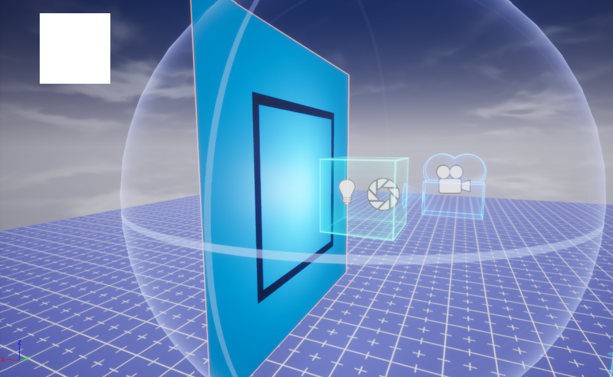
Create Background
The background will be used behind the object that will be rendered to the UI image. The material and color can be changed to get a different background based on the object being rendered. For example, a different color for epic items, and a different color for legendary items.
- In Core Content type
Plane 1minto the search to find Plane 1m - One Sided and add it into the Client Context. Rename it toBackground. - Set the Position in the Properties window to X
601, Z350. - Set the Rotation in the Properties window to Y
90. - Set the Scale in the Properties window to X
6, Y6, Z6.
Create Frame
The frame will show in the rendered image. This is optional.
- In Core Content type
Pipe - 4into the search to find Pipe - 4-Sided Thin and add it into the Client Context. Rename it toFrame. - Set the Position in the Properties window to X
600, Z350. - Set the Rotation in the Properties window to Y
90. - Set the Scale in the Properties window to X
3.6, Y3.6, Z0.01.
Create Point Light
A point like will add a sphere gradient to the background and light up the object being rendered from behind, which will give it a nice effect.
- In Core Content search for
Point Lightand add it into the Client Context. - Set the Position in the Properties window to X
500, Z350. - In the light Properties window, set the Intensity to
35, and Attenuation Radius to400. - Adjust the light color to suit the game.
Create Dummy Object
The dummy object is used to show the bounds of what the camera will be rendering. So objects placed within the dummy object will be displayed in the UI.
- In Core Content search for
Dummy Objectand add it into the Client Context. - Set the Position in the Properties window to X
460, Z350. - In the Properties window, set the X Scale to
1.4, Y Scale to1.4, Z Scale to1.4.
Create CameraCaptureClient Script
Capturing images needs to be done from a Lua script. The Camera object has a function called Capture that takes in an argument that specifies the resolution of the capture.
Create a new script called CameraCaptureClient and place it into the Client Context in the Hierarchy.
Add Custom Properties
The CameraCaptureClient script needs references to the UI image and Camera to use.
- Add the UI Icon image as a custom property and name it
Icon. - Add the Camera as a custom property and name it
Camera.
Open up the CameraCaptureClient script and create references to the properties.
local ICON = script:GetCustomProperty("Icon"):WaitForObject()
local CAMERA = script:GetCustomProperty("Camera"):WaitForObject()
Camera Capture
Create the following code, which will create a capture using the Capture function, and passing in a resolution. The Capture function will return a CameraCapture object that may be used to display this image or refresh the capture. The Capture function may return nil if the total budget (8,388,608 pixels) is reached.
A CameraCapture can be refreshed or released. When releasing a CameraCapture the instance will become invalid and should no longer be used.
local capture = CAMERA:Capture(CameraCaptureResolution.SMALL)

ICON:SetCameraCapture(capture)
Test the Icon Generator
Place an object within the bounds of the dummy object, and enter play mode. You should see the object, frame, and background show in the UI.
Learn More
UIControl | UIText | Events | CameraCapture | Camera | Binding Sets | Input API